Cadus — Addressing nonprofit’s inconsistent donations
I collaborated with Cadus to redefine their branding and increase donation opportunities. Working closely with the team, we aligned on the desired message. Then, I redesigned Home and Donation pages, applying updated brand visuals and copy to effectively convey that message.
Problem
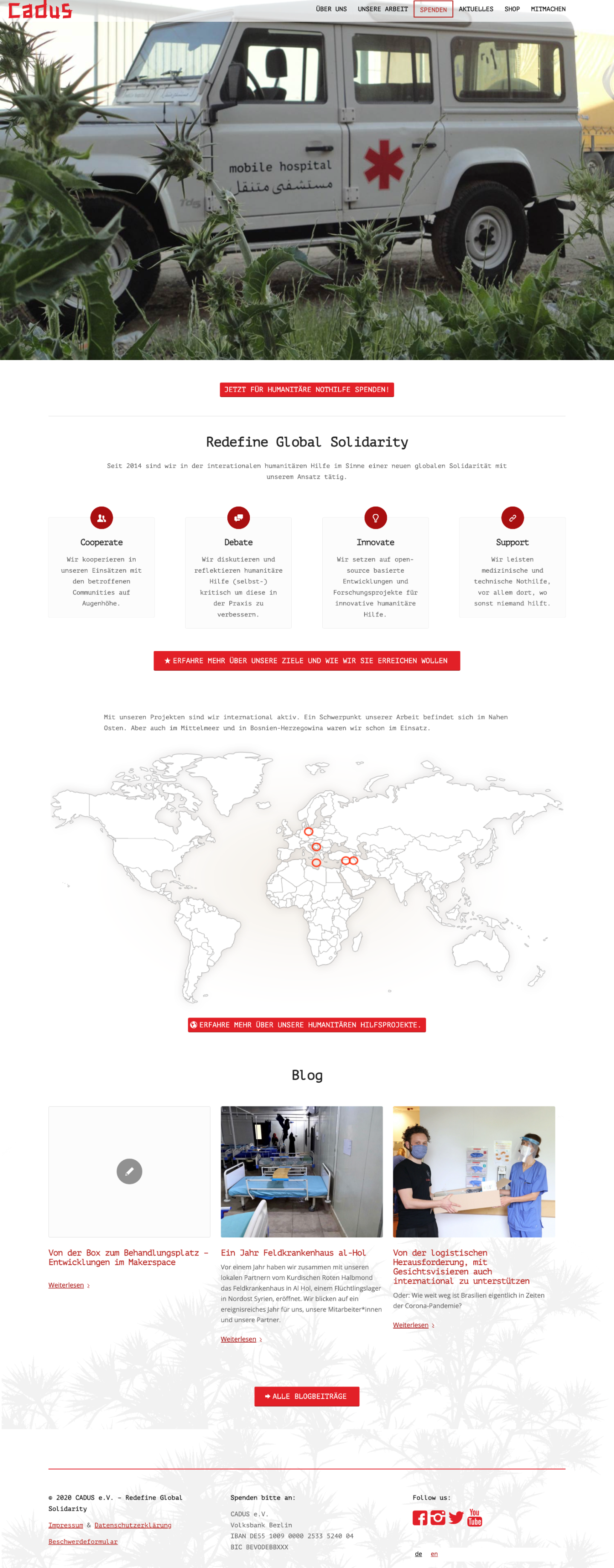
Cadus website should accurately reflect the nonprofit’s values, communicate their story and resonate with the audience. Since it was created long time ago, it no longer met Cadus’ expectations, resulting in low or inconsistent donation levels.
Bringing Cadus closer to donors
The website audience are sponsors of humanitarian causes.
Through competitor analysis and research around donations, we’ve learnt that prospective donors seek a sense of inclusion and direct impact on those in need.
We also found out that the current branding was conveying a message different from Cadus’ goal.
My role
As the UX Designer, I worked along with the PR Manager to analyze the status-quo and redefine Cadus’ message.
My job was to conduct stakeholder interview and desk research around NGO and donations and optimize website pages following heuristic principles and using new brand visuals and donor-centric copy.

Big transformation through 3 small fixes
Due to limited resources and technical constraints of the website we had to narrow down the scope to 2 pages directly impacting donations.
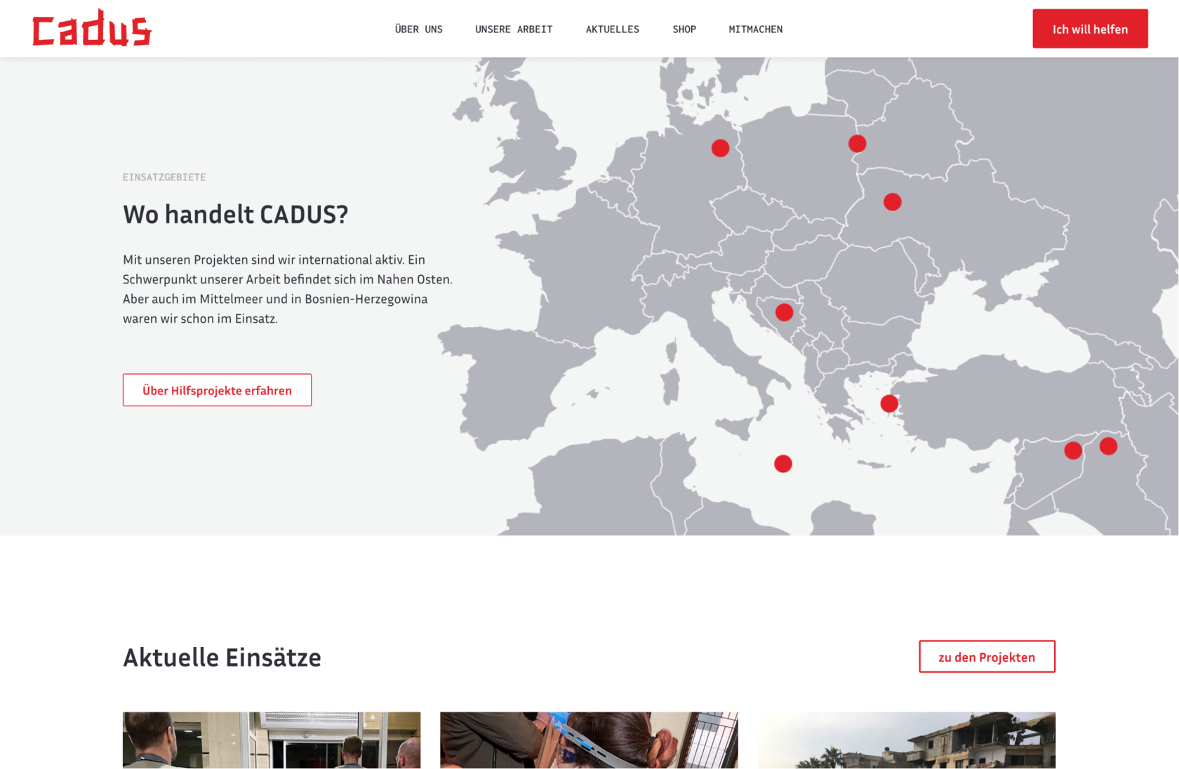
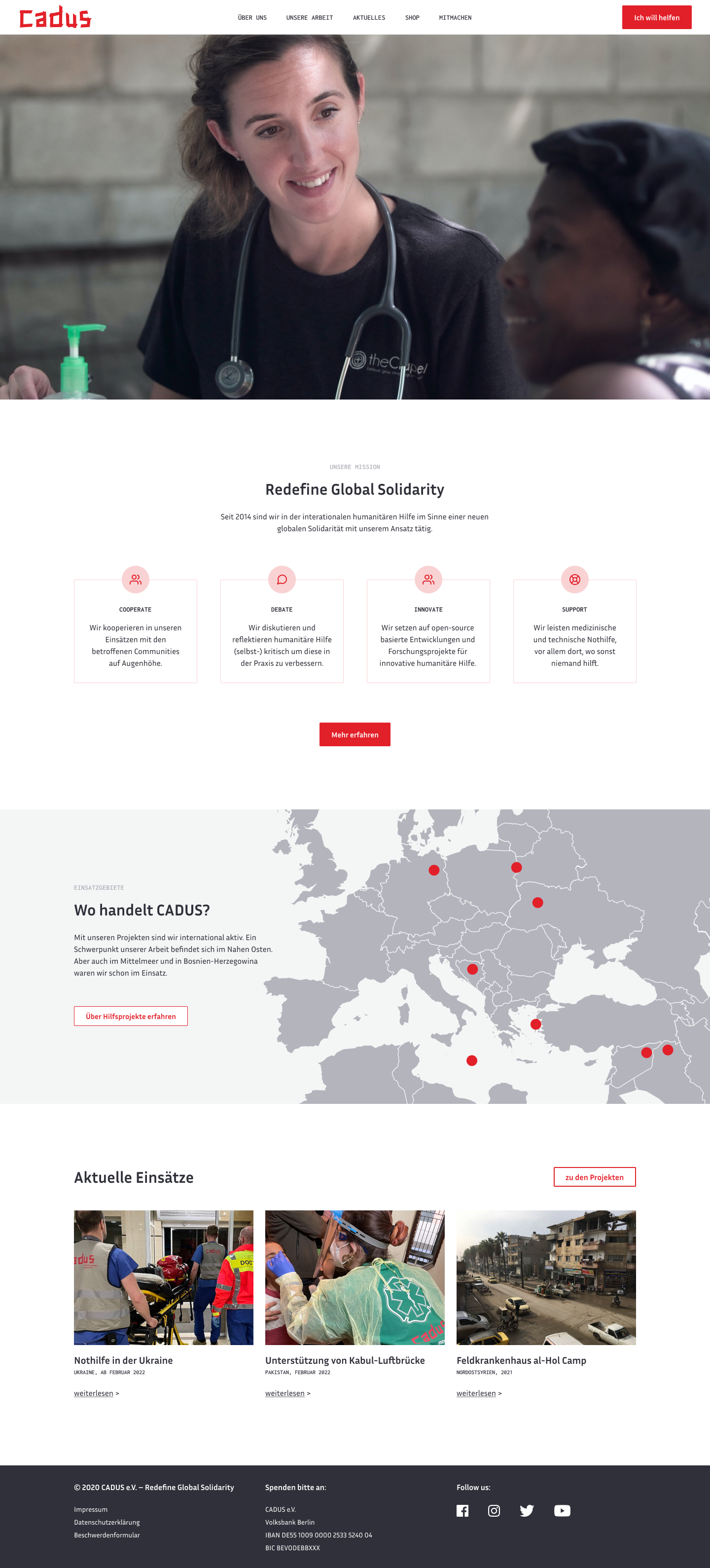
To draw user’s attention to donations, we’ve simplified the navigation bar.
Home page had to be visually appealing and easily scannable for visitors, so we made important details more visually obvious, removed irrelevant content and optimized copy to make it tell Cadus’ story.

Donation page was the most challenging as we couldn’t change the donation form provided as external service, so we made the texts donor-centric to emphasize their impact in helping those in need.

OTHER CASE STUDIES
Improving information findability on publich health insurance website.
UX analysis, B2C, information architecture, card sorting, sitemap, wireframing.
Tackling low market share of a mobile learning app.
UX Design, B2C, market research, desk research, information architecture, interaction design.
Solving low customer adoption in insurtech SaaS product.
Product design, B2B2C, UX research, prototyping, testing, design system.